

Samayalarai
poster in progress

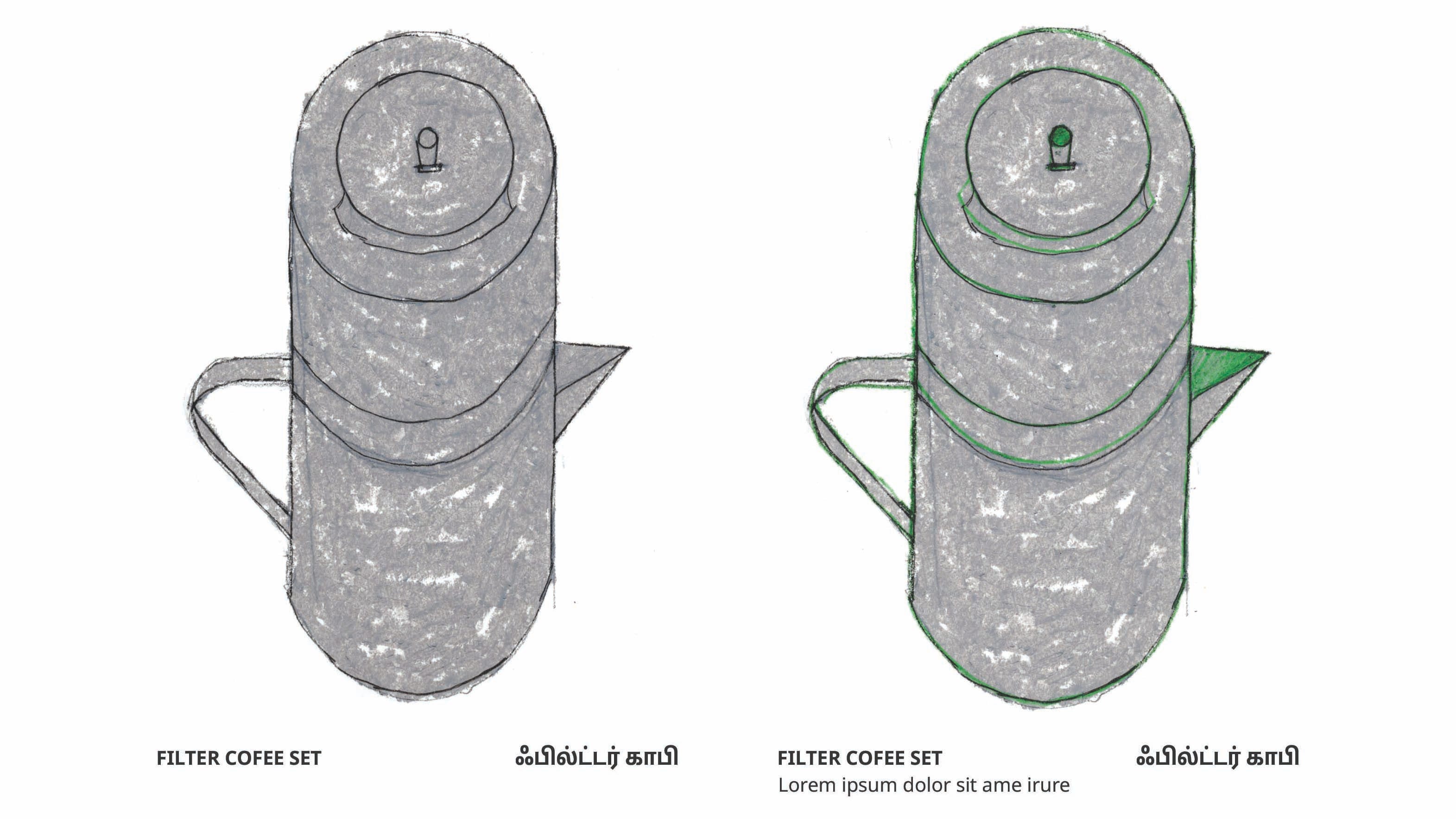
I visited home last October. I was there to see family, but really to see the house I grew up in. It was being renovated, and I wanted to see how it had changed.
It had changed a lot. And I had an unexpected, slow but dramatic reaction to the whole thing. I haven’t figured out how to talk about it all, but I wanted to record what the house looked like when I was growing up, the rooms, the furniture, the souvenirs my parents brought back from holidays, and the plants in the backyard. I wanted to preserve it all.
This poster comes from that desire to preserve things, and I wanted to start by cataloging my mom’s kitchen, amma’s samayalarai. சமையலறை / Sa-ma-ya-la-rai is a Tamil word, samayal, to cook, and arai, a room, a cooking room, or kitchen.
Some of the first things I took when I moved out for college were the utensils from her kitchen, especially her filter coffee set (#22), a wedding gift from my grandmother, engraved with her initials, HRM, Harur Rajagopal Mangayarthilagam (her hometown, father’s name, and her own). That set traveled with us on holidays, then eventually moved out with me, to New York, then to Berlin. But those were only a few of the objects from her kitchen. There are many items from her kitchen I could never have in my Berlin apartment, like the stovetop rice cooker (#7), which would definitely set off the fire alarm, or the aruvamanai (#28), a chopping tool designed to be used sitting down, which I’ve only seen my grandma use.
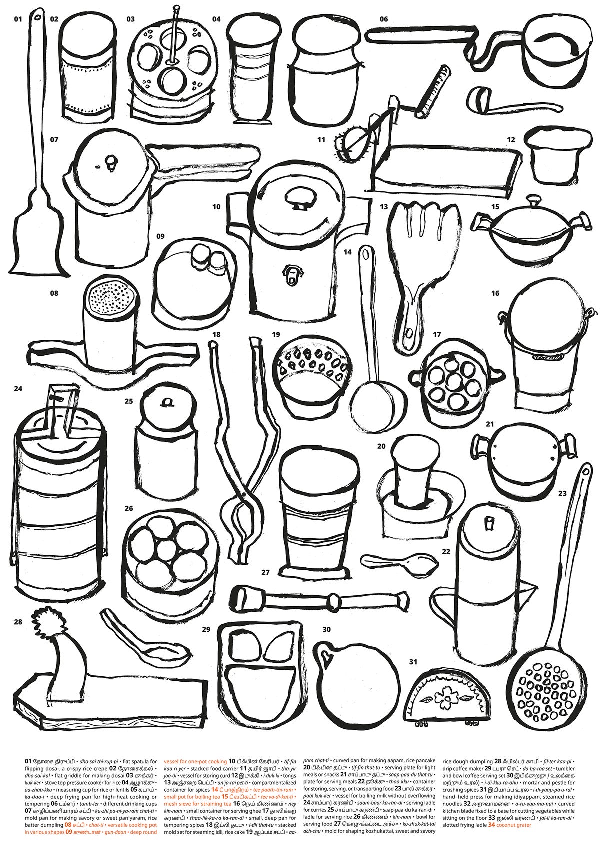
This poster brings together all the objects from that kitchen, a typical Tamil/South Indian kitchen from my childhood.
Note: Numbers in brackets, example (#22), refer to the numbered objects in Draft 2 of the poster
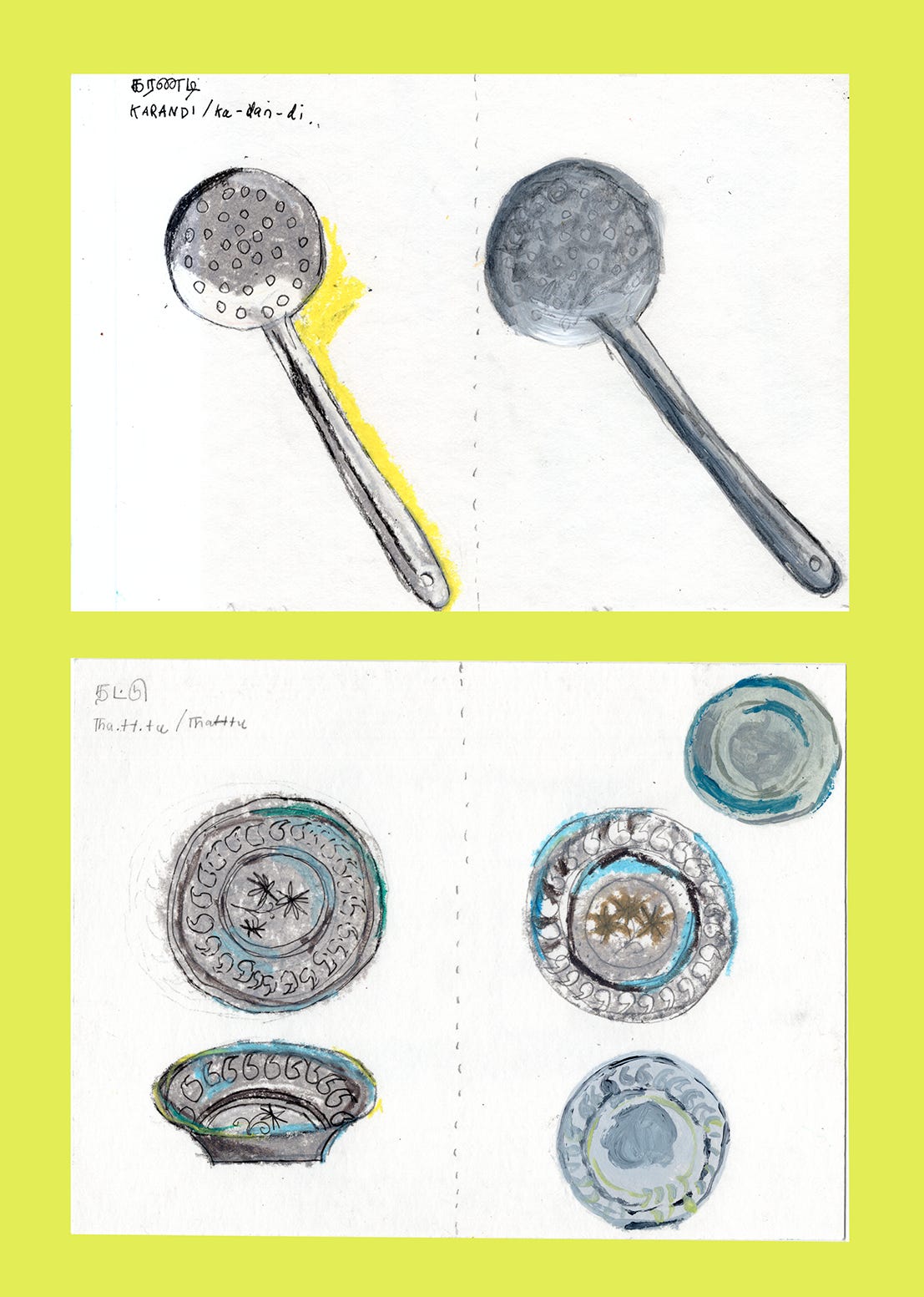
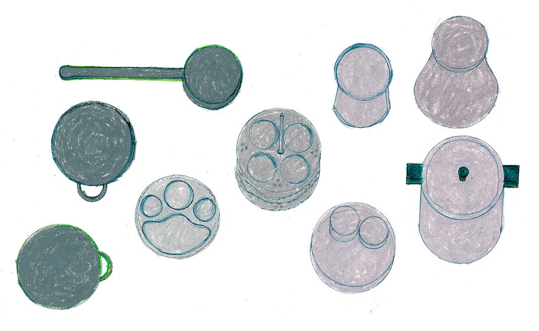
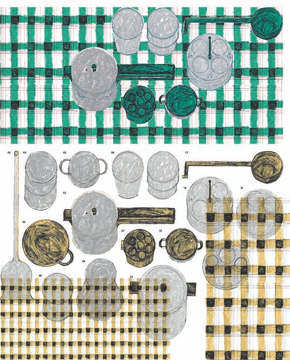
process
I designed this utensil poster sort of as a supplement to something else - what else, I’m not yet sure (it could be part of a booklet of recipes, and this poster is folded and tucked in there).
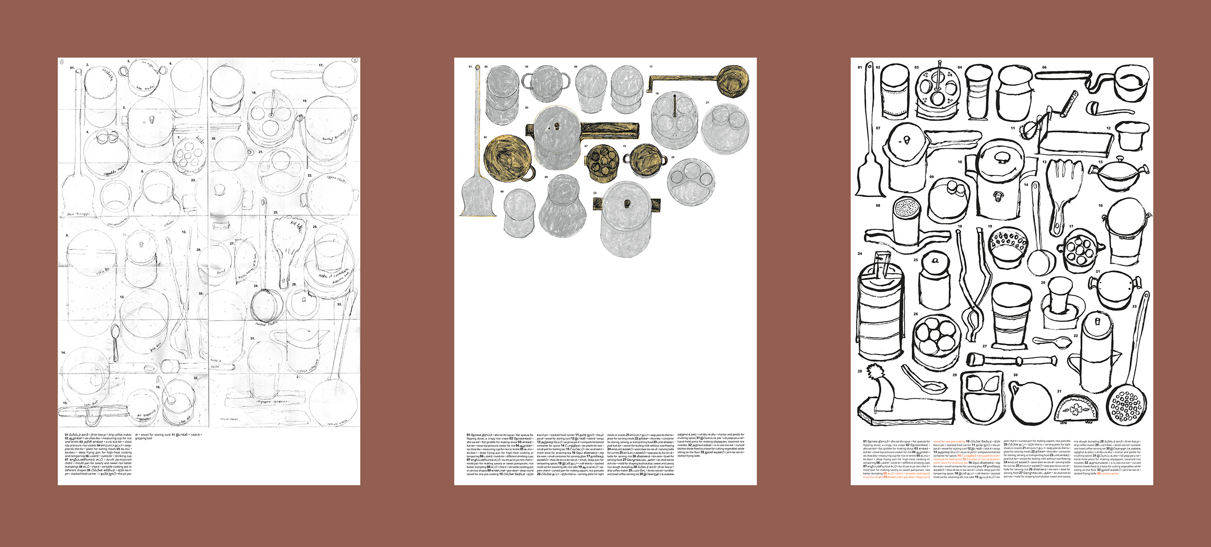
I made a list of the everyday utensils in the samayalarai, and once I had a sketch down, I started setting the type. I wanted the poster to act as a reference (a catalog of utensils) - I wanted the illustration to be the primary focus and the text to act as secondary (if someone wanted to know what they were looking at, they could refer to the object’s number and find its Tamil name, pronunciation in phonetic English, and what it is used for or the dish that is made in it).
I found reference images for most objects (on the Ratna Stores website) that resembled the shapes of the utensils in her kitchen, but some are just drawn from memory, like the thayir jaddi (#25) and the spice dabba (#26).
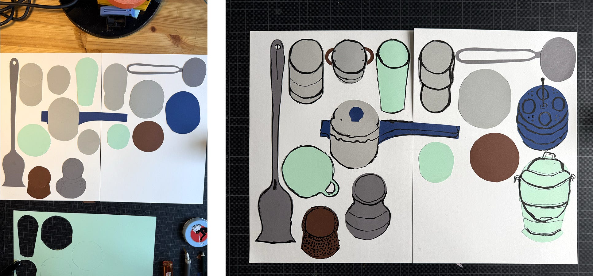
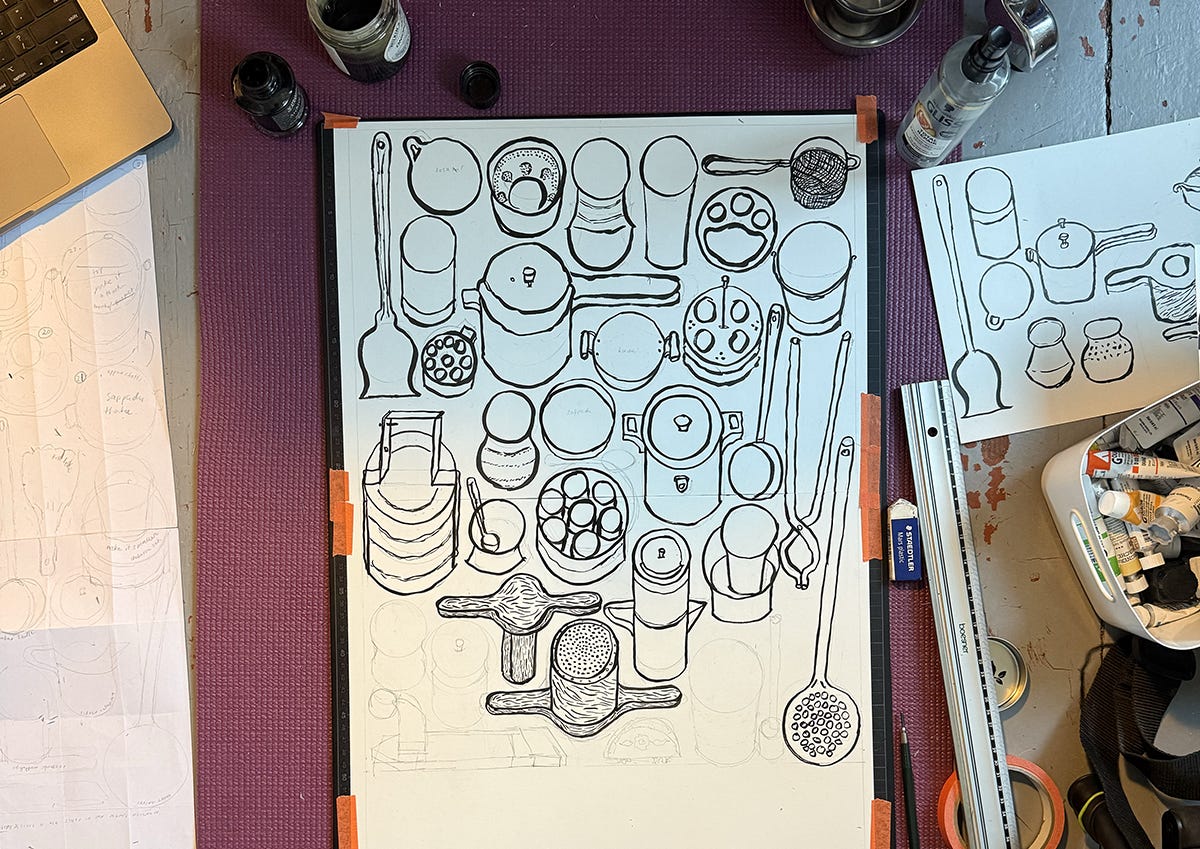
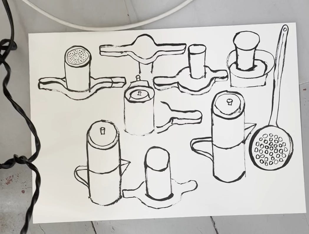
As I worked on the illustrations, I tried out different mediums and found them all a little rigid on the page, especially with the reference text at the bottom. I wanted the poster to intrigue viewers about these utensils, but it wasn’t doing that for me. So I decided to draw with a brush and ink, a little less control over the medium, and more play, and it created these lines and shapes I really liked. And I went with it.
next
The poster is designed in A2 format, and I’m planning to print it in risograph (it would be the largest poster I’ve printed on riso), and in two colors: black for the text and metallic silver for all the stainless steel vessels.
I plan on adding a few more objects to the poster - I can’t imagine not having the tea pathram or the vadikatti (the small pot made for boiling tea and strainer) on there, feels too quintessential to a Tamil (or really, any Indian) household. Giving the poster a title. Doing some test prints (to check for legibility). Then riso print.
Thanks for reading through my process :)
—Yogee
These are lovely Yogee!!!!!